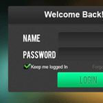
Recently, I’ve been thinking how to change my login screen on WordPress; so instead of getting my hands dirty I decided to create a mock up first. Today I will share with you how I created the login screen in photoshop, and how easy it is to create one. We will use dark colors with bokeh image behind the login screen to add vibrant and life.
You can download the PSD at the bottom of this tutorial!
End Product

If you’re following my tutorial for a while, you’ll noticed that I tend to use simple techniques to create detailed designs. These techniques are often overlook by some, also since these are simple it means that they are easy to use.
Let’s Begin

Oven your canvas and set the width to 450px and eight to 300px.

Grab this image (right click > save ) drag this over to your Photoshop canvas and select Filter > Blur > Gaussian Blur set it to 25.2%.

This is what it looks like. Now we will create the login form.

Grab your Rounded Rectangular Tool (U) and set the radius to 3px, draw the same shape as above and fill it with #3a3a3a. Name this layer body.

Now, create a new layer name it noised. Click the body layer while still selecting noised layer, fill it with #3a3a3a and go to Filter > Noise > add Noise and set it to 1.5%.

Again, create a new layer name this one header. Select your Marquee Tool (M) and fill it with #000000, now to delete the edges on top click the body layer while still highlighting the header layer. After that press CTRL + Shift + I and press delete.

On header layer, select Blending Options > Gradient and follow the color settings above.

This is your header should look like, now we will add some detailed line.

Create a new layer and name it white line, select Single Row Marquee Tool (M) and draw a line 1px from header bottom color #ffffff. Set the Opacity to 16px.

We will add some text, I use Bebas font 27pt Color #ffffff on name and password text. Arial Bold 24pt on Welcome text.

Grab your Rounded Rectangle Tool and set the radius to 3px, draw the same shape as above.

Select Blending Options > Inner Shadow and set the Blending mode to “Normal” and color to #565a63, Opacity to 100% and Angle is 90%, Distance and Size is 1.

Now on Gradient, follow the colors above.

In Stroke set the Size to 1 and color to #302f2f.

Here is the input fields that we created, just create duplicate (CTRL +J) and move it below to align with password text.

Create a new layer, name it checkbox and use Marquee Tool (M) create a small square below password text. Fill it with #000000.

Grab this check box image and add some text, I use Arial Regular 13pt color is #ffffff. For the forgot password color #686868.

Select your Rounded Rectangle Tool (U) and set radius to 3px. Draw the shape same as above, this will be our submit button.

Now select Blending Options > Inner Shadow and set the color #87FCCE, Opacity to 100% and Distance, Size to 1.

Follow your Gradient colors like the one above.

Now, set the Gradient Opacity to 100% and Angle 90.

For Stroke, color is #05743F and Size 1px, Opacity 100%.

Add the text Login, Bebas was the font used, 23pt color is #05a056. We will add some details to the text.

Fort Login text, Blending Options > Drop Shadow and follow the settings above.

This is our end result. As you can see, little details can go a long way when using it especially we’ve done it with simple techniques too! You can use this form in any way you want, feel free to download.
I hope you’ve learned something new today, using a vibrant background to give life to our dark login screen, using light colors for call-to-action button and keeping it simple is the way to go. If you have other login screen suggestions let me know.
[sociallocker id=”3494″]
Download Now!
[/sociallocker]


