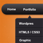
Designing a Navigation Bar is one of the key success of any website, the visually appealing and interactive it is the better. Today we will create a Sleek Navigation Bar in Photoshop. I will show you how easy it is to create a navigation bar using Photoshop.
Navigation Bar is one of the things that will keep your users busy on your site, if you make it hard for them will leave your site instantly. If you noticed my navigation bar on top is really just text, I am thinking of redesigning the site, so watch out for that 🙂
You can download the PSD at the bottom of this tutorial!
Sleek Navigation Bar

Let’s begin

Open your Photoshop and set the size for our canvas.

Grab the Rounded Rectangle Tool (U) and set the radius to 50px and draw the shape same as above. Name this main-nav.

In Blending Options > Drop Shadow, set the color to #b9b8b8 and the rest are default.

On Inner Shadow, set the color to #fffafa Distance and Size are set to 1px.

Gradient Colors, copy the settings above.
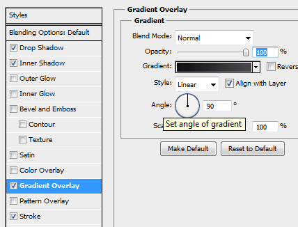
In Gradient Settings, just change the angle to 90
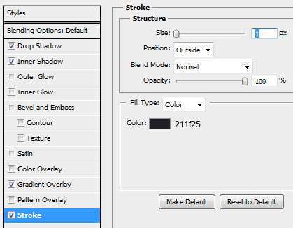
Stroke, set color to #211f25 and size to 1px.
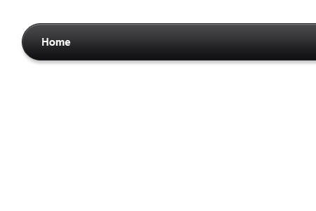
You should have the same image as above, I also added some text for the navigation. I use Arial Bold 15pt #ffffff.

I added a couple more text links on our navigation.

Now we will create our 2nd level navigation, grab Rounded Rectangular Tool (U) set the radius to 8px and draw the shape same as above. Name this 2nd level nav.
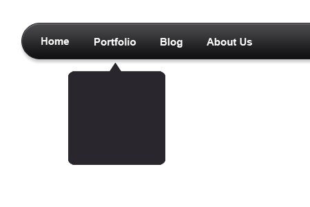
For the arrow head, use the Custom Shape Tool (U) and select the rectangle one. Create the shape on top of the 2nd level nav layer, if you think they fit the size hold SHIFT and click 2nd level nav layer and the rectangle layer and hit CRTL + E (we will merge the two). We now have a one image, fill the color with #29272d.

In Blending Options > Drop Shadow, set the color to #acacac and the rest are default.

Inner Shadow, use the color #fffafa and set the size and distance to 1px.
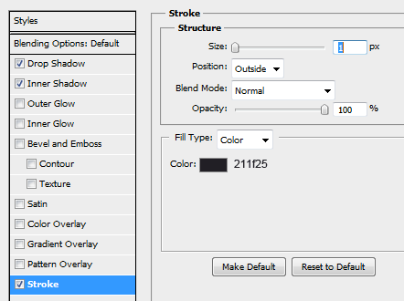
In Stroke, the color is #211f25 and set the size to 1px.
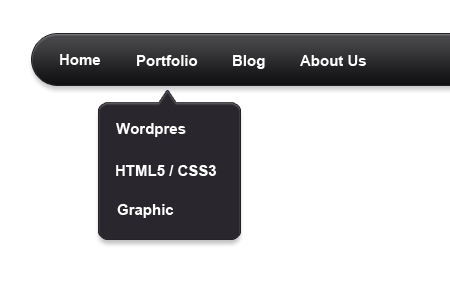
Yours should be like the one above, I also added some text links too!

We will add some sunken lines between the text links, select Single Row Marquee Tool (M) and create a new layer (name line one) between the text draw the lines. The first color is #000000, then use your brush set the size to 60px and brush the lines inside the 2nd layer nav. Create another layer (without removing the single row marquee highlight on canvas) and use the brush with the following color #38363c.

Your lines should be like this when zoomed. This is called sunken effect, we will use this technique more often.

Our 2nd level navigation is done! Now continue the steps to create a 3rd level navigation, I know you can do that! 😉

This is how your 3rd level navigation should look like, but if you have an alternative design please let me know 🙂 Now all we have to do is add a background to make our design stand out, I use patterns and other images I found online. You can use whatever you think fits.
Final Result of Sleek Navigation Bar

Here it is! Our final piece was done and we are good to go! I really enjoyed making this navigation bar because I rarely design them (look at my navigation, hint..hint!) I want to code this on CSS and Jquery, anyone interested? 🙂
[sociallocker id=”3494″]
Download Now![/sociallocker]

