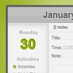
I’ve been experimenting with the planner app I found on Google, after a couple of minutes I had a “what if” moment. Then I open my good ‘ole pal Photoshop and started throwing some pixels, minutes later I am done with the design.
Today I will show you how to create your own planner UI in Photoshop, I am pretty new on UI design so if there are UI Ninja’s out there you’re opinion is much appreciated. 🙂
You can download the PSD at the bottom of this tutorial!
UI Planner

Let’s Begin

Open your canvas (CTRL + N) and set the width to 450px and height 300px.

Grab your Rounded Rectangular Tool (U), set the radius to 3px and create the same shape as above. Name this layer index.

In your index layer, right click > Blending Option > Inner Glow set the color to 2b2727, leave the rest to default.

Create a new layer (CTRL + SHIFT + N) and select Marquee Tool (M) draw the rectangle shape and fill it with #bababa. Name this layer main-header

Create a new layer again (CTRL + SHIFT + N), using your Marquee Tool (M) create a rectangle half the shape of the main-header layer, fill it with #c0c0c0. Name this layer light-header.

Now on new layer, select Single Row Marquee Tool (M) and create a 1px line at the bottom of main-layer, use the color #a2a1a1 Opacity 63%. Name this line-header-dark, do not deselect the Marquee Tool yet, create a new layer again and use color #ffffff. Name this light-header.

On your keyboard, select light-header layer and press arrow key down once. This will move the layer 1px.

Type in those text, I use Arial Bold 22pt, fill it with #686767.

In Drop Shadow, set Blend Mode to normal and distance, size to 1px.

Inner Shadow distance and size to 1px, color #787878.

Stroke change the color to #ffffff and size to 1px.

Here’s a preview of our header, looking good? Moving on!

Create a new layer (CTRL + SHIFT + N) and select Marquee Tool, draw the shape same as above. Go to Filter > Noise > add Noise, set it to 1% and hit OK. Name this layer sidebar.

On your sidebar layer, Inner Shadow set the angle to 51% and color #a5a3a3 and size to 10px.

Now create a date number I use Arial Bold 36pt color #91ab16.

Drop Shadow Blend Mode is set to normal, color is #ffffff distance and size are default.

Inner Shadow’s color #8fae11 and angle 51%, distance and size set to 1px.

Stroke’s color #ededed and size set to 1px.

Here is the effect of what we’ve done. I added the day text, font is Arial 13pt color #c0c0c0.

Drop shadow’s Blend Mode is normal, color #ffffff and the rest are default.

Inner Shadow’s color #aeaeae, distance and size are set to 1px.

Stroke size 1px and color #ffffff.

Type in these text, and select Monday layer right click > copy layer style, now head on to activities layer right click > paste layer style. Save’s us some time.

Now I added a few text, I use Arial 10pt color #949393. You can write here whatever you want 🙂

Grab your Ellipse Tool (U) and create a circle bullet. Tip: Hold CTRL while dragging the shape to create a perfect sphere.

Drop Shadow’s color #000000, size and distance is 1px, angle should be 90.

Inner Glow set the Opacity to 57%, color to #ffffff and size to 1px.

Stroke’s color #90aa1e and size 1px.

Duplicate the bullet layers and you should have a good looking list.

Grab your Single Row Marquee Tool (M) and draw a line, once selected use your brush and select color #dbdbdb the said line.

Type in those text, I use Arial 10pt #6f6f6f, make sure they have equal spacing.
![]()
Grab those pixelated icons here, and drag them on the canvas.

Put those text at the bottom of the menu, I use Arial 11pt color #7e7e7e.

In title text Drop Shadow, set the Blend Mode to normal and color #ffffff, distance and size are set to 1px.

Inner Shadow color is #aeaeae, distance and size set to 1px.

Stroke size is set to 1px and Opacity 66%.

We will use the Single Row Marquee Tool again for creating a line. Set your foreground to #e0e0e0 and fill the area selected.

Here is my line guide to help, delete the excess line on the new layer we just created earlier.

Create a new text and use the line guides before, (I removed them so you can see clearly) Just copy the layer style of title text and were ready for the next one.

Duplicate the lines that we created earlier, I also added time text, the font is Arial 11pt #c7c7c7.

For our save button, select Rounded Rectangle Tool (U) and set the radius to 3px. Fill it with #d9e0b9.

From the downloaded icons, select the tick icon and drag it on the canvas. Type in save, font was Arial 11pt #6f6f70.

Select Rounded Rectangle Tool (U) and fill it with #e1e1e1, text color and size are the same. Use the cross icon from the file.

The hard part is already done, now to make it float we will use Marquee Tool (M) and draw a thin rectangle shape fill it with #545454.

After that go to Filter > Blur > Gaussian Blur and set it to 5% depending on the shadow effect. Set your Opacity to 48%.

After that, add some background and you are done! We have our very own UI that we can use on our next development. Feel free to download and use it for your next project.
Now, I wonder how we can use this PSD if we want to incorporate this into an Iphone app? Any ideas?
[sociallocker id=”3494″]
Download Now![/sociallocker]


