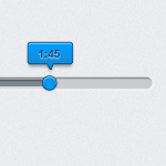
Sliders are being used on website as part of UI’s, they send the message to the user telling them to wait or their program is already running. To make it more entertaining some designers creates colorful slider bar, while others make it more interactive to the user.
Today we will create a slider that has a tooltip, so whenever a user hovers on the slider bar they can see how much longer they have before the program ends. The concept of a slider is pretty much the same with progress bar, but please don’t be confuse between the two.
Tooltip is also a fancy UI that designers uses, so we will combine the two to have a cool result. This is actually a continuation of our Web Mini UI post, but for this tutorial we will focused on the slider tooltip.
You can download the PSD at the bottom of this tutorial!
Progress Bar with Tooltip

Let’s Begin

Open your Canvas and set the size to 450px by 300.

Grab your Rounded Rectangle Tool (U) and set the radius to 50px, create the same shape as above and name this layer as background-slider.

Now go to Blending Options > Drop Shadow and set your Blend Mode to Normal, color to #ffffff, angle to 120, and distance / size to 1px.

Next is Inner Shadow, set your color to #646464 and distance to 1px.

Select your Rounded Rectangle Tool (U) with same radius settings and use the color #7d8791.

Blending Options > Drop Shadow, Blend Mode is set to normal, angle is 120, distance and size is set to 1px. Pretty much the same as the first one.

Inner Shadow’s settings, color is #646464 distance and size is 1px.

This is what we have so far, moving on.

Now we will create more like a ticker (not sure if that’s what it’s called) Select your Ellipse Tool (U) and set the radius to 100px, draw a circle at the end of the slider. Hold alt when dragging to have a perfect circle.

Blending Options > Drop Shadow, blend mode set to normal and color is #989b9d, angle is set to 90 and distance to 1px, size 3px.

Inner Shadow, set the color #8dd1fc and angle to 90, distance and size 1px.

In Gradient Color, follow these colors and hit OK.

Follow the Gradient Settings, notice the angle is set to 12.

In stroke, we will use Gradient too. So set this colors in and move on.

On Stroke, set the size to 1px and angle to 90, and Opacity to 100%.

Now grab Rounded Rectangle Tool (U) and set the radius to 3px, draw the same shape as above.

Now select Custom Shape Tool (you have to right click where rounded rectangle is on the palette) and in the upper menu select the shape named Arrow 6.

Draw the arrow near the rectangle shape that we did earlier, now we have two shapes on the canvas.

Now drag the arrow shape and rotate it so it is facing the bottom. Make sure that it is properly align with the rectangle shape.

Now hold CTRL and click on the arrow layer, rectangle layer and press CTRL + E. We just merge the two layer so we can start styling it.

Inner Shadow, set the Blend Mode to normal and color #8dd1fc, distance is set to1px and size to 0.

On Gradient Color Settings, follow the colors above.

Here is the Gradient Settings, set the angle to 90 and reverse.

In stroke we used the Gradient Fill type, set the size to 1px and Opacity to 100%.

Follow the color settings for Stroke Gradient.

Yours should end up like this, I also added a text and I use Arial bold #0d6da9 15pt.

In text Drop Shadow, set the Blend Mode to normal and color #ffffff, distance and size is set to 1px.

Inner Shadow select the color #0a629a and set the size to 1px.
Final Result

We are done! As you can see adding a couple of things will make your UI fancy, also making it easier for our user to understand is the best way to go.
Now, if there’s anyone whose interested to show me how to convert this into a working CSS? Anyone? 🙂
[sociallocker id=”3494″]
Download Now![/sociallocker]


