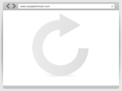
When showing off your portfolio of websites you’ve built, it is a good idea to insert the image using a browser frame to add the website’s feel of how it would look like on a real browser.
When visiting different design blogs with portfolio, I saw the growing trends that other designer using it. For example is devpress theme page, while it is rather minimalist still you can see how they used it on their site.
I was thinking that I should also add this to my portfolio page, but since I would love to add some of my Photoshop Design it would not seem appropriate.
Enough with the intro! Let’s learn how to create a mini-browser frame in photoshop that we can use on our portfolio page, below is the final product.
You can download the PSD at the bottom of this tutorial!

Let’s Begin

Open your Photoshop and set the canvas to 400px by 300px.

Grab your Rounded Rectangle Tool (U) and set the radius to 5px. Name this as body, fill it with #ffffff.

Create a new layer, name this footer and grab your Marquee Tool (M) and draw a rectangle below the body layer, fill it with #cfcfcf. Now hold CTRL + Click on the body layer while footer layer was still selected and hit CTRL + SHIFT + Del button. This will delete the excess areas outside the body layer.

Right click on the footer layer > Blending Options > Gradient Overlay and apply this colors above.

Follow the gradient settings above.

For footer stroke, use #b7b7b7 and set the size to 1px.
To create a header, follow the same steps for footer. This time make it more larger, and copy the layer style of footer by right click on footer and select copy layer style, right click on header layer and paste layer style. I know you can do it! 😉

For the back and forward button, select the Custom Shapes Tool (U) and select the shape same as above.

After that, duplicate the forward button and hit CTRL + T and right click select vertical. You should now have the same as above.

Grab your Rounded Rectangle Tool (U) and set the radius to 3px, fill this one with #ffffff. Name this address bar.

On address bar layer, Blending Options > Stroke set the foreground color to #bebcbc and size to 1px.

I added some text inside the address bar, I use Arial Regular 2pt #7e7e7e.

We will create a shadow, new layer and name this shadow. Grab Marquee Tool (M) and select the same shape as the one above. Fill it with #000.

Select Filter > Gaussian Blur and set 3.6px, Opacity 33%. Create a duplicate CTRL + J and position it on the left side behind the body layer.

We just add some finishing touches and we are done! When I started creating this mini-browser I though that it will be hard since the size and limited design, but turns out this is one of the easiest I’ve done, meaning you can do it too :).
If you created one of your own, why not show it off in the comments! Also I’d like to see how you use it on your portfolio.
[sociallocker id=”3494″]
Download Now![/sociallocker]


