I’ve been seeing a lot of Dark Websites lately, and it inspires me to make one. Today we will create dark web design which we will do in Photoshop. I will show you how to achieve the look of dark websites and still look professional.
Today we will create a dark web design and we will use our very good pal Photoshop, we will learn a few tricks like:
- Textured background
- Creating our own shadow
- Detailed line
- Light Effects
You can download the PSD at the bottom of this tutorial!
Here is the End Product, just to give you an idea what we are going to do.

Let’s Begin
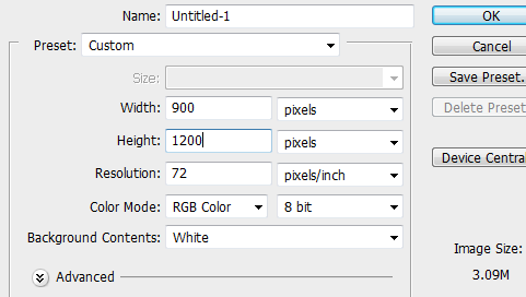
Open your Canvas and set your width to 900px and height to 1200px, Background remain as default. Double click your background layer and fill it with color #d4d4d4.

On the top of your menu select Filter > Noise> Add Noise, and set it to 2% after that hit OK. This will create the textured effect.

Now select about 30px from the top using your Marquee tool (M), and create a new layer fill it with #5a5a5a.

On the header layer right click and select Blending Options > Gradient, set this color as Foreground #565656 and this one as background #262722. Select reverse and click ok.

Now we will add a text logo, select Eras Bold ITC and set it as regular. First type in the word “Advisor”, then highlight the “Ad”letter and color it with white, now highlight the rest of the letters and fill it with #be082a.

Now create a new layer and select your Elliptical Marquee Tool (M) and draw the shape same as above. Fill it with #ffffff.

Now select Filter > Blur > Gaussian Blur and set it to 30.0px.

You should also set the Opacity of the light effect to 29px. Here is the final result of our logo.

Now we will style our Logo, select Blending Options > Drop Shadow and set the color to #000000, Distance to 1 and Size to 1.

Now for the Inner Shadow, set the foreground color to #ffffff and Distance to 1 same with size.

For Inner Glow, all you have to do is change the foreground color to #fc8a8a and hit Ok.

Your logo should look like the one above, neat!

For the navigation, Home was selected that’s why it was colored #000000. The font is Arial, Bold and 23pt the rest is #ffffff though.

Let’s start with Home text on navigation, in Blending Options select Drop Shadow and set the Foreground to #ffffff and the rest are default.
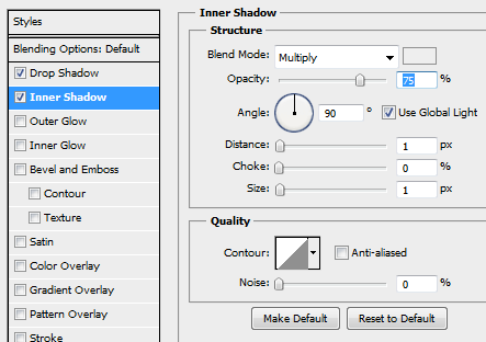
Inner Glow set the Foreground color to #efefef and Distance to 1 same with Size.

Noticed that we also added a light effect on the Home link, just re-use the technique we used on the logo before.

We will start creating a slider holder, create new layer (Ctrl + J) and set your Foreground to #bb0527 and we will do another noised texture on this layer.
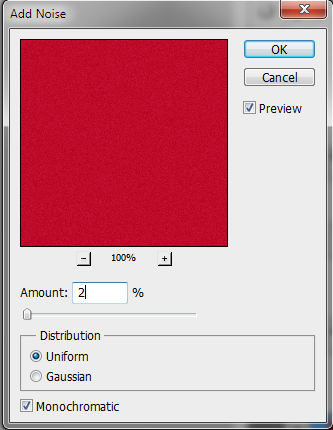
Select Filter > Noise > Add Noise and set it to 2% and hit OK.

Create another layer (Ctrl + J) and use your Marquee Tool (M) draw a rectangular shape (this will be our slideshow) and fill it with #ccc8c8.
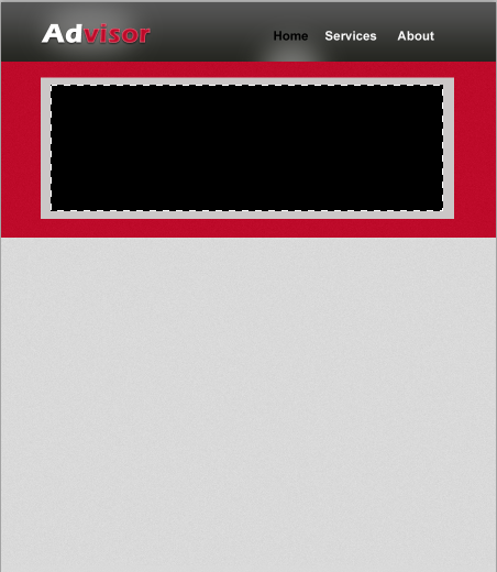
Create another layer, this time smaller than the first one. fill it with #000.

Now use this image (included in the download) and drag it in the canvas. Make sure that the image is above the layer of the slideshow, now right click the image layer > select Create Clipping Mask, the image will go inside the slideshow layer.

We will create a shadow for the slideshow, duplicate the slider layer (the gray colored layer) and drag it below the slider layer. Fill it with #000000 and press Ctrl + T and right click, select Warp. Drag the bottom upward.

Select Filter > Blur > Gaussian Blur and set the pixels to 5.5 Opacity to 37%.

This is our final image for the slider shadow. I also added a three columns for our services, these icons are included in the download link.

At the bottom of the slider we will create our welcome intro page, I used Arial Bold Italic and 23pt color is #ffffff. After that select Blending Options > Drop Shadow and set the distance to 1 and size 1, color is set to default.

I also added some text. Use Arial regular 18pt color #4c4747.
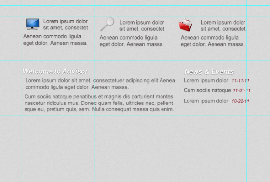
On the right side I added a News & Events title, the style is the same with welcome layer. Just right click on the welcome layer and select copy layer style, now select the news and events layer right click and select paste layer.
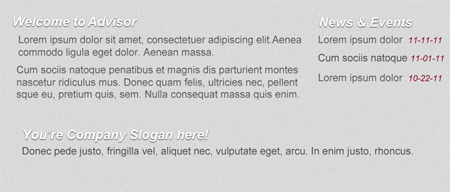
At the bottom of the page, add this text. After this we will add a “Get a Quote” button.

At the very end of the text select your Rounded Rectangle Tool, set your radius to 5px and create this shape.

In Blending Options select Drop Shadow and set the color to #ffffff, Distance and Size to 1.

Now on Inner Shadow set your color to #f0ebeb and Distance and Size are 1.

Set your Stroke size to 1 and color to #979696 hit OK.

We will add some text, just type in “Get a Quote”. Font used is Arial Bold Italic 18pt color is #595757.

This is our lower page looks like, now we will add the footer.

At the very bottom of the page create new layer, use your Marquee Tool (M) and fill it with #585858.
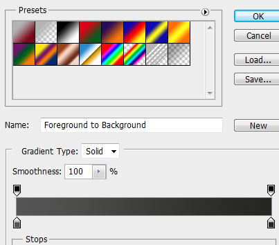
In footer layer, Blending Options > Gradient and set your foreground to #565656 and background color to #262722.
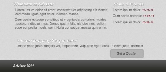
I added the title text at the footer too. Just set the color to #ffffff and use Arial Bold Italic.

Now it’s time to add some details, select the Single Row Marquee Tool (M) and create a new layer, set the line between the logo and slideshow.

On the first layer fill it with #515150, now use the Single Row Marquee Tool again and press down arrow once. Create a new layer and fill it with #db7488. You should have the same effect as above.

We also added lines under services and above quote page. Just follow the steps above and always create a new layer.
Finally we are finished, you can use the techniques you’ve learned from this tutorial to create other web design layout. Using noise texture adds life to a plain color background, same with the shadow that we created.
[sociallocker id=”3494″]Download[/sociallocker]
We created the dark web design using simple layout design and new techniques. Hope you’ve learn a lot and if you have different versions of design you can add it using the comments below.

