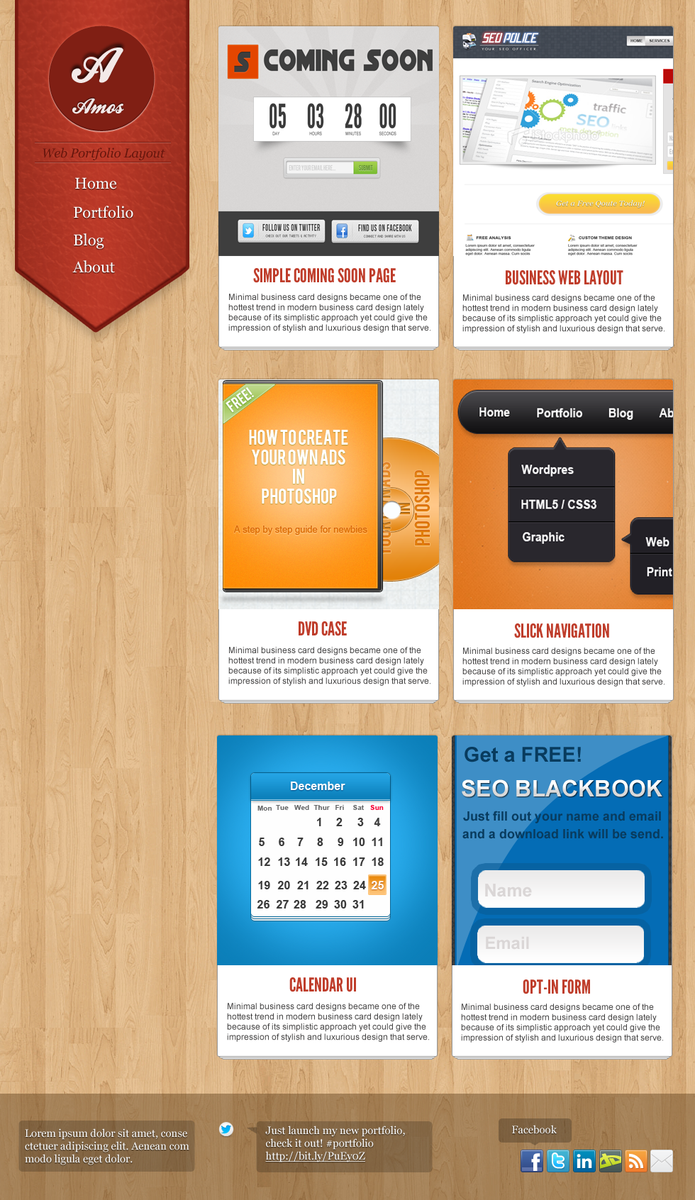
As a designer creating an awesome portfolio will get you or land you a job, this is the very first step every web designer should do if they want to gain more clients. Since it’s our portfolio will be the basis of our skill, we need to push ourselves a little bit 🙂
Today we will create an Awesome Portfolio Layout in Photoshop, we will be using a two-column layout using different textures and details. We will also use some design trends that are being used by popular websites.
You can download the PSD at the bottom of this tutorial!
Before we start, there are a couple of things that we need to download / set up.
Things that we need:
- Wood texture from Deviantart
- League Gothic from Fontsquirrel
- Ballpark from Fontsquirrel
- Twitter Bird from Iconarchive
- Leather Texture from Freestock Images
- Social Media icons here (can’t remeber where I download it)
Final Product

Let’s Begin!

Open your Canvas and set the size to 980px width and 1692px height.

Fill the page with the wood texture, duplicate it (CTRL + J) to cover the entire page. Make sure that the wood lines go seamless. Next is grab your Marquee Tool (M), create a new layout (CTRL + SHIFT + J) and draw a rectangle shape near the top left of the page fill it with #403E3E.

Select Pen Tool (P) and CTRL + R to display the ruler, set those guides so you know the middle part of it. Draw the arrow-like shape at the tip of the rectangle layer and right click > Make selection. Now hit CTRL + I this will inverse the selected area and press DEL.

Here is the cut version.

In Blending Options > Inner Shadow set the foreground to #751a10 and -90 on angle, size and distance to 3px.

In Gradient Color Settings, copy the colors above and hit ok.

In Gradient overlay settings, set the style to reflected and angle at 0.

Stroke, change the foreground color to 7a1b11 and size to 4px.

Use our Leather texture and put it above the logo layer, hold CTRL and click the logo layer, press CTRL + I to inverse the selection and hit DEL.

In leather texture layer we set it to overlay and opacity to10%. This is what it should look like.

Grab your Ellipse Tool (U) and draw a circle shape, hold SHIFT to create a perfect circle.

In Blending Options, Drop Shadow set the foreground to #fff, angle to 90 and distance, size to 1px.

For Inner Shadow’s foreground color #741b11 and angle -90 distance and size 1px.

Outer Glow foreground color is #801f14 and the rest are default

Inner Glow foreground is #00000 and leave the rest

Here is our complete circle logo

On the font logo, we use Ballpark on the A text color is #ffffff and 71pt, drop shadow is set to default.
Next is we will create a new line, grab the Single Row Marquee Tool (M) and click just below the circle logo. Fill in using foreground color #7b1d12, duplicate the layer and fill it with #ffffff opacity 50%. Duplicate this layer again and drag it below.

We now have this, next is the navigation 🙂

We added the navigation, font was Georgia 22pt color #ffffff.

Drop shadow for the navigation, foreground #000000 size and distance to 1px.

Duplicate the logo layer and go to Filter > Blur > Guassian Blur and set it to 5.7px

For the content post, grab your Rounded Rectangle Tool (U) radius to 5px, foreground to#ffffff.

In Blending Options > Drop Shadow foreground color is #adadad, distance and size is 1px.

Stroke’s foreground color #9b9b9b and size is 1px.

Duplicate the layer (CTRL + J) two times, and press the CTRL + arrow key down two times so it will go down 2px for each layer.

Next is to grab any image that is big enough, I use my old tutorial for this case. Right click on the layer > Rasterize the image. Now hold CTRL + click on the content post layer and hit DEL after. It should delete the excess on the image.

This is the complete content post image that we have.

Here is the finished content post, we duplicate the layers and changed the images. Neat!

On the footer, create a new layer (CTRL + SHIFT + N) and grab Marquee Tool (M) fill it with #000000 Opacty 44%.
On the left part bottom part of the page grab your Rounded Rectangle Tool (U) and fill it with #000000, Opacity 20%.
We added some text, font used was Georgia 15pt color #ffffff.
We also added a drop shadow to the text, set your foreground to #000000 distance and size 1px.
In the middle we use twitter widget, use the twitter image from iconarchive and duplicate the rounded layer. Text are the same format as the first one, we also a line to display the link.
To create an arrow-like for the twitter widget. Select your Pen Tool (P) and draw an arrow like and then right click > make selection and copy the opacity on the background layer.

As for the pop up, use the same technique we did with twitter arrow bubble. For the social media icons, we just aligned them and we are done!
Hope you like our tutorial! Feel free to comment if you have other tutorial ideas 🙂
[sociallocker id=”3494″]
Download Now![/sociallocker]


