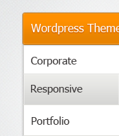
Accordion has been popularly used on navigation, because you can store a lot of links and it only consumes so little space. I think that is one of the strength of accordion, and others are beginning to use as content sliders just like slidedeck.
Today we will learn how to create accordion design using Photoshop, the techniques and tools that we are going to use are fairly easy. What I am aiming to accomplish is to share some awesome methods for creating web design elements in this sort of style and theme.
You can download the PSD at the bottom of this tutorial!
Accordion Design
Let’s Begin

Open you Photoshop, follow the size for the canvas.
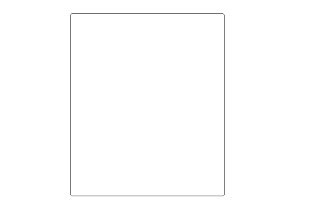
Grab your Rounded Rectangular Tool (U) and set the radius to 3px, draw the same shape as above. Name this layer as body.
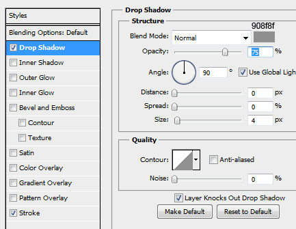
On body layer, right click > Blending Options > Drop Shadow and set the Blend Mode to Normal, color #908f8f and size to 4.
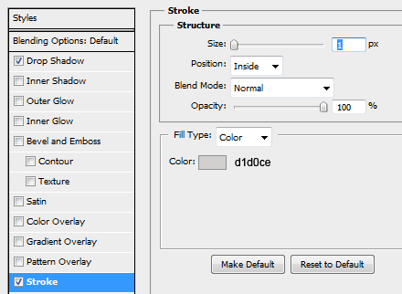
Next is Stroke, color is set to #d1d0ce and size is 1px.
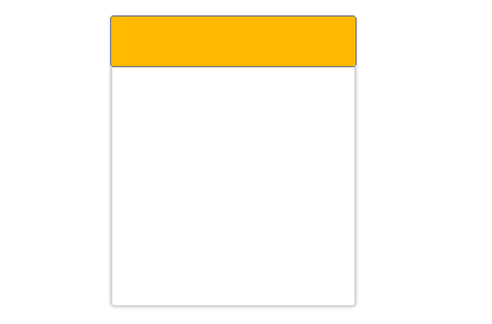
Grab your Rounded Rectangular Tool (U) again and draw a header like shape, we will name this as header.

In Drop Shadow, Blend Mode is normal and color is #b5b5b5 and angle is set to 90, distance and size is 1px.
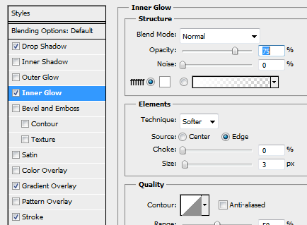
Inner Shadow, same as Drop Shadow’s Blend Mode. Color is #ffffff and size is 3px.

In Gradient Color Settings, copy the colors above and hit Ok.
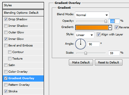
This is the Gradient Settings, check the reverse let’s move on.

In Stroke, size is set to 1px and color is #bd6c04

Our header output should be the same, now we will create a sunken line. Create a new layer and name it line-light, grab Single Column Marquee Tool (M) and draw a line on the header.
Next is to select the color #ffffff and use the brush to color the line, create a new layer again (name line-dark) and this time use the color #bd6c04. After that, deselect (CTRL + D) and use your arrow keys, hit left 1 time this will move the dark layer 1px to the left.

Click on the line layers and CTRL + Click on header layer, press CTRL + SHIFT + I and hit Delete, do this on the other line layer. This will delete the excess line in header layer.

On your Custom Shape Tool, select the arrow shape and put it in the right side of the header.

Now using Marquee Tool (M) cut the excess part of the arrow, fill it with #ffffff.
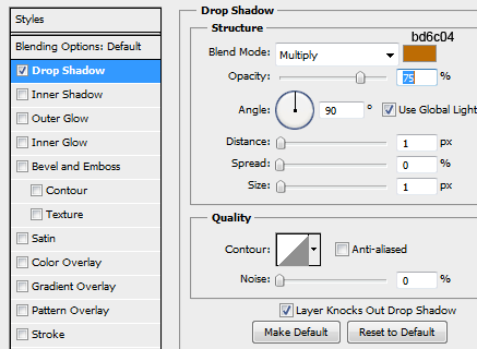
On arrow layer, select Blending Options > Drop Shadow and set the color to #bd6c04, distance and size to 1px.
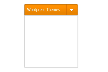
You can compare the arrow details now, I also added some text in advance 🙂 I use Tahoma Regular 16pt color is #ffffff.
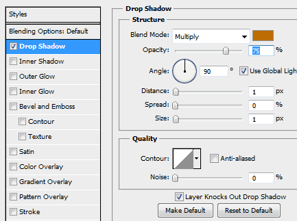
Text Drop Shadow, color is #bd6c04 and distance and size is 1px, same as the arrow drop shadow settings.
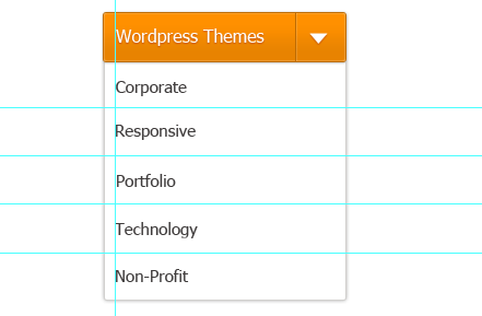
I activated the Ruler Guide CTRL + R, and set the margins for the text. The text font is the same as the header.

Now use the Single Row Marquee Tool (M) and draw a line, same steps as before but we will use a different color #e0e0dd. Duplicate the layer and drag them below each text.
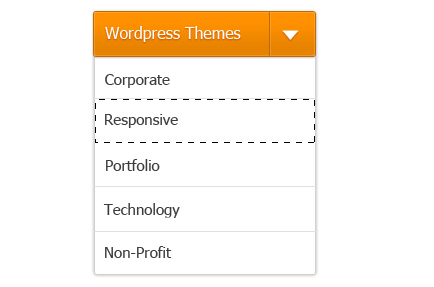
Now we will create a hover state on the accordion menu, grab your Marquee Tool (M) and create a new layer name it hover-state.

On hover-state layer’s Gradient Color settings copy the colors and hit Ok.
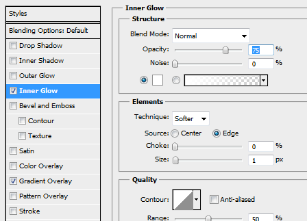
Inner Glow, size is 1px and color is #fffffff and we are done!
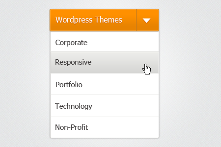
Final Product

I added some details like the hand pointer and textured background so it will look more awesome! You can even use dark background for this one, so it will bring the header color to life.
Now, the next step is to convert this into HTML / CSS and jquery so we can use it on our web projects, interested?
[sociallocker id=”3494″]
Download Now![/sociallocker]

