Search bar are one of the essential component of a website, if you have thousands among thousands of post, you really need to put a search bar on your homepage or sidebar. And if your search bar is a little boring, users tend to look somewhere else, so you need to put a little bit of effort on creating your search bar, you can use cool Jquery autocomplete or some animation.
View the demo here.
You can download the HTML zip at the bottom of this tutorial!
Today we will bring to life the 3D search bar that we did in the past, this tutorial will help you to start everything from scratch. I think this is a good way to practice your skills in HTML and CSS.

View the demo here
If you missed the PSD tutorial you can go here, and make sure you download the PSD (we will wait for you). Now that you’re back we will start the slicing part, we will only slice two image then we will code it. Easy 😉
Slicing the PSD

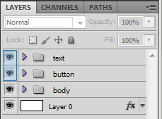
On the 3d Search Bar PSD. Click the eye beside the layer on text ,layer 0 and button, this will make them invisible on the canvas.

You will now have a clean input field like this. Now crop it and save it as png.

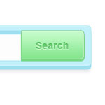
Next is the buttons, what we did is duplicate the folder button and inside that folder, move the button-shadow layer 1px above. Crop it as little space as possible and same format as above. You can even grab this image 🙂
Code the 3D Search Bar
Now you can close Photoshop and open your code editor, we will start to code the search bar.
<html><body> <div id="wrapper"><!--wrapper--> <h2>How to Create a 3D Search Bar in HTML / CSS</h2> <p><a href="#">← Back to the tutorial</a> </p> <div id="search"><!--search--> <input type="text" name="search_field" id="search_field" /> <div><!--submit--> <input type="submit" value="search" /> </div><!--submit--> </div><!--search--> </div><!--wrapper--> </body></html>
You can see that I’ve commented all of the div’s, this is a good practice when creating a html. The only important part here is the.
<pre><div id="search"><!--search-->
<input type="text" name="search_field" id="search_field" />
<div><!--submit-->
<input type="submit" value="search" />
</div><!--submit-->
</div><!--search-->
Now we will use the images that we sliced. We will use CSS to achieve this.
body{
background: url(bg_white.jpg) repeat;
}
#wrapper{
width:400px;
margin:0 auto;
}
#wrapper h2{
text-align:center;
color:#0f3883;
font:bold 40px Arial, Helvetica, sans-serif;
text-shadow:0 2px 1px #fff;
}
#wrapper a{
color:#666;
text-decoration:underline;
text-shadow:0 1px 1px #fff;
}
#wrapper a:hover{
color:#666;
text-decoration:none;
text-shadow:0 1px 1px #fff;
}

#search{
background:url(3D-search-bar-body.png) no-repeat;
width:419px;
height:103px;
}
#search input[type="text"] {
border:0;
float: left;
height: 43px;
margin: 23px 0 0 22px;
width: 260px;
color:#c0f0fc;
font:bold 24px Arial, Helvetica, sans-serif;
text-shadow:0 2px 1px #9fdcef;
-moz-border-radius:3px;
-webkit-border-radius:3px;
border-radius:3px;
}
.submit input[type="submit"]{
background:url(button.png) no-repeat;
float:right;
height:57px;
width:115px;
text-indent:-9999px;
border:0;
margin: 15px 19px 0 0;
cursor:pointer;
}
.submit input[type="submit"]:hover{
background-position:0 -55px;
}

#search{
background:url(3D-search-bar-body.png) no-repeat;
width:419px;
height:103px;
}
Let me break down the CSS for you, first we called the background of our entire search bar.
#search input[type="text"] {
border:0;
float: left;
height: 43px;
margin: 23px 0 0 22px;
width: 260px;
color:#c0f0fc;
font:bold 24px Arial, Helvetica, sans-serif;
text-shadow:0 2px 1px #9fdcef;
-moz-border-radius:3px;
-webkit-border-radius:3px;
border-radius:3px;
}
Next is we style our input field, and keep it align with the background using float and margin. Finally giving it the CSS rounded corners so we won’t see any flaws on the design.
.submit input[type="submit"]{
background:url(button.png) no-repeat;
float:right;
height:57px;
width:115px;
text-indent:-9999px;
border:0;
margin: 15px 19px 0 0;
cursor:pointer;
}
On our submit button, we used the CSS technique called CSS Sprite (read more about it on CSS-Tricks). We use the images as background but cut the upper part by using height, aligning them using float and margin. Cursor changes the pointer to a hand, just thought you should know 🙂
.submit input[type="submit"]:hover{
background-position:0 -55px;
}
Upon hovering the button, the image position will go up by -55px. That’s the exact height of the upper button.
If you wanted to learn more about this push button effect, this tutorial will explain it better for you.
And we are done with the coding, easy isn’t? 🙂 You can use this on your WordPress themes or HTML Projects, you can also add new interactive design on your search bar.
Creating such simple design combined with CSS will give us endless possibilities on creating new way of designing our site, whether for clients or personal use. I suggest that you should follow good practice while learning so you’ll have a solid ground when you mature as a designer.
[sociallocker id=”3494″]
Download Now![/sociallocker]


