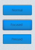
Web UI has been the buzz for the past several months, as I tried to learn about this new trend I noticed that there are only a couple of them posting a tutorial about this. So today we will create a Mini Web UI Button in Photoshop, if there are demands about the rest of the UI maybe I’ll do a second part tutorial about it.
As web technologies progress, websites and web applications are becoming more responsive, providing us with more ways and techniques to interact with the users.
I decided to focused on buttons because that is the hardest part of the UI Design (really, I find it hard), anyway here is the end result of our Mini Web UI Design.
You can download the PSD at the bottom of this tutorial!

Let’s Begin

Open your Canvas and set to 450px width and 255px height.

Select your Foreground to #d8dde3 and fill the canvas, now go to Filter > Noise > Add Noise and set it to 2% hit OK.
Normal State

Grab your Rounded Rectangle Tool (M) and set the radius to 2px, draw the shape same as above. Name this layer as Normal Button (better if you’ll put this on group folder).

In Normal Button layer, right click > Blending Options and set the Gradient Foreground Color to #009CFF and background color to 1D87CA.

Set your drop shadow settings as the one above. Foreground color is #979B9C, Distance is 1 and Size is 3.

Now moving on Inner Shadow, set your Foreground Color to #8DDOFB and Distance is 1.

On Stroke > Fill Type > Select Gradient, now select this color for your stroke gradient. Foreground is #O44F7F and Background is #45E98.

You should have something like the one above. Notice the light line above? That’s from Inner Shadow 🙂 moving on to text.

Type in the word Normal, and use the color #O65O7F on the text.

Still on the Normal text layer, select Blending Options > Drop Shadow and set your Foreground color to #2BAAFA, Opacity to 100% and Distance to 1.

This is our end result for normal button.
Focused State
We are now designing for focused state, it will be easier than the normal button though.

Grab your Rounded Rectangle Tool, and set your radius to 2px. Create a new shape beside normal button and name the layer as focused button.

Right click > Blending Options > Gradient and follow the settings above.

Now on Drop Shadow, set your Foreground color to #989D9D and Distance to 1 Size to 3.

For Inner Shadow, set your Foreground colo to #8DD1FC and Distance to 1.

In Outer Glow, Foreground is #000000 and Opacity is 100%. Elements > Spread 100% and Size is 3px. Quality > Range is 50%

Stroke > Fill Type select Gradient and set your angle to 90 and the following colors are listed below.

Set your Foreground to #OO9CFF and Background to #45E98.

This is the result for the Focused State Button. Now to add some text!

I typed in Focused, now we can add some details.

In Focused text layer, right click > Blending Options and select Drop Shadow and set your foreground to #2BAAFA and Distance to 1.

Here is the result of Focused button state, looking neat eh?
Now for the third one which is the Pressed State or Clicked State I challenge you to create it, you won’t learn from me if I do all the work right? It is really simple actually, I’ll even give you a hint 🙂
Just copy the normal button and in blending options you’ll have to remove one, Change and exchange the properties for the two; gradient remains the same though.

Did you figure it out? Look closely and remember the steps we did with Normal Button. I already gave you the hint, didn’t I? 😀

Here is the whole set of our Mini Web UI, I hope you’ll enjoy following this tutorial and feel free to comment is you have questions, or you just wanted to show what you did. Looking forward to your end product guys!
[sociallocker id=”3494″]Download[/sociallocker]


