Responsive Web Design is getting more and more popular these days, most of the themes that are in the themeforest are boasting with responsive feature.
If you are planning to create one for yourself and not sure where to start, you’ll need some frameworks to guide you and save you a lot of time. First, what is a framework? A good post from prothemer.com explains this;
To help you paint a better picture: plan, base, shell, frame, scheme, skeleton, structure, blueprint and groundwork. All of the synonyms above represent some kind of starting point, head start or foundation upon which to continue building in order to complete what is needed. You may also get the feeling that most of the words indicate that a lot of the work is already complete, especially the important groundwork.
According to AlistApart;
The goal here is to allow the designer or developer to focus on tasks that are unique to a given project, rather than reinventing the wheel each time around. Generally speaking, this is the approach taken by the aforementioned JavaScript and web application frameworks.
Basically it will save you a lot of time in the process, now here is the list of collection that I found when I am searching for responsive frameworks, hope one of these bad boys can help you in your future projects 🙂
Mobile Boilerplate

Mobile Boilerplate is your trusted template made custom for creating rich and performant mobile web apps. You get cross-browser consistency among A-grade smartphones, and fallback support for legacy Blackberry, Symbian, and IE Mobile.
Skeleton

Skeleton is a small collection of CSS & JS files that can help you rapidly develop sites that look beautiful at any size, be it a 17″ laptop screen or an iPhone.
*I’ve used Skeleton for a couple of projects before and it is really easy.
Hardboiled CSS3 Media Queries
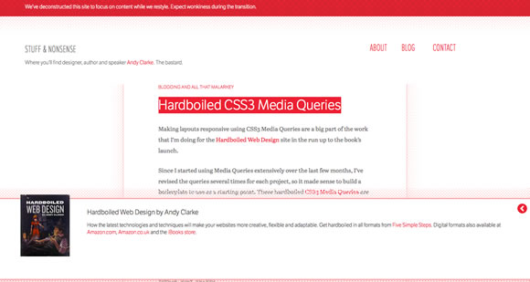
These hardboiled CSS3 Media Queries are empty placeholders for targeting the devices and attributes I’m interesting in making responsive designs for right now.
tiny fluid grid

The happy & awesome way to build fluid grid based websites.
FluidGrids
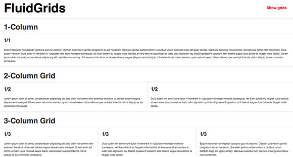
A CSS framework for rapid interactive prototyping.
Less Framework

Less Framework is a CSS grid system for designing adaptive websites. It contains 4 layouts and 3 sets of typography presets, all based on a single grid.
CSS Grid

The 1140 grid fits perfectly into a 1280 monitor. On smaller monitors it becomes fluid and adapts to the width of the browser.
inuit.css

inuit.css is built to work on smaller screens (such as tablets) and tiny screens (such as phones) straight out of the box with minimal effort.
flurid
A cross-browser CSS grid framework that doesn’t hide pixels in margins!
Fluid Grid

A web grid system designed by Joseph Silvashy and New Gold Leaf that allows designers to use the screen real estate on large monitors and retain great design on smaller ones.
320 and Up

‘320 and Up’ prevents mobile devices from downloading desktop assets by using a tiny screen’s stylesheet as its starting point.
Foundation

Foundation is a a 12-column, future-friendly responsive grid framework that includes dozens of styles and elements to help you quickly put together clickable prototypes, that can then be adapted and styled into polished production code.
MQFramework

The responsive MQFramework, based on a 12 column grid, has been structured to suit different needs, be it from a new project to fitting into an existing project with very little changes to the code. One CSS file imports the framework files and a custom stylesheet for the design of your site.
Golden Grid System

The Golden Grid System is a folding grid system for responsive design. It splits the screen into 18 even columns. The leftmost and rightmost columns are used as the outer margins of the grid, which leaves 16 columns for use in design.
Fluid Baseline Grid

The Fluid Baseline Grid system was built with typographic standards in mind and combines the key principals of fluid-column layouts, baseline grids and mobile-first responsive design into a resolution independent and device agnostic framework.
Columnal

Columnal, a 1140px wide grid system, has been inspired by the cssgrid.net and 960.gs. It makes web design easier by making your grids fluid, dynamically changing based on the browser size and switching to a mobile-style layout if the width is small enough.
The Semantic Grid System
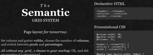
The Semantic Grid System is a responsive grid system that lets you set column and gutter widths, choose the number of columns, and switch between pixels and percentages without any ugly .grid_x classes in your markup.
The Goldilocks Approach

The Goldilocks Approach uses a combination of Ems, Max-Width, Media Queries and Pattern Translations to consider just three states that allow your designs to be resolution independent.
It is a minimal framework that includes well commented CSS files that consider 3 CSS Media Query increments (multi column, narrow column and single column) and an HTML boilerplate file to get you started.
Frameless

BluCSS is a lightweight CSS framework designed with ease of use and simplicity in mind. It is also extremely responsive with four distinct stages: Desktop screen, laptop, tablet, and mobile.
Gridless
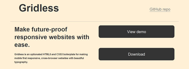
Gridless is an HTML5 and CSS3 boilerplate for making future-proof responsive websites. You can easily create responsive, cross-browser websites with beautiful typography. It is simple and straightforward and doesn’t come with any predefined grid systems or non-semantic classes.
Responsive Grid System

It’s a quick, easy & flexible way to create a responsive web site.
These frameworks are here to help so why not use them, after all you might learn a thing or two about this frameworks and you can add them to your arsenal of development 🙂
I’ve used a couple of them and trying to learn a few more, and I’d say they definitely helped me save a lot of time coding. If you created your own and want to add to the list, give me a shout on the comments below.


