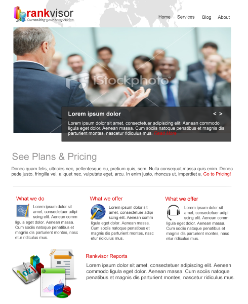
Today I will teach you how to create a clean corporate website using Photoshop, in this tutorial I will go step by step to show you how easy it is to create a website layout and how effective it will be.
Our sample client will be a SEO company, since it’s corporate our approach should be professional, clean, and easy to navigate.
Before we start download the images that we will use.
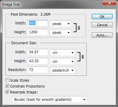
Let’s start with creating a blank canvas with the size of 980×1200.

Now, divide the canvas into three parts, two for the margin and the other is for dividing the content.
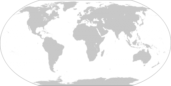
Grab this image that I found, and put in the upper middle of the canvas.

The globe image will be used as background. Erase the part that I highlighted, this won’t show anyway on our site. Also erase the circle part of the globe, after cleaning the side part turn the opacity to 50%.

After you’ve cleaned the globe image, your image should look like this.
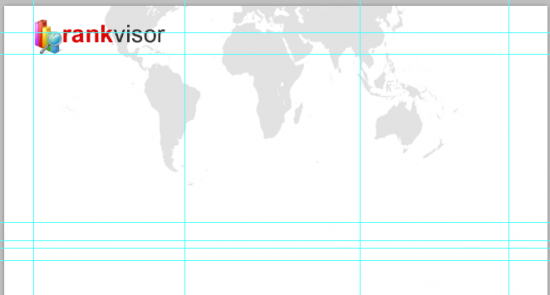
Our logo is composed of icon and Arial font, changed to color of the word “visor” to #000000 this creates an effect. Really simple.

As for the navigation, we will keep it really simple and self explanatory so our users won’t have any difficulty using it. I used arial 23pt.

Now, grab the istock photo from the downloaded folder. This will be our slideshow for the banner.
Re-size the image to full width of the margin, then we will add the title and description of the banner slideshow. Grab your Marquee tool (M) and between half way the image fill it with black (make sure you’re doing this on a new layer).
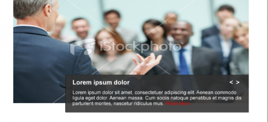
As you can see I added a title and text, I didn’t explain it in details because it is really easy to create. Also I added slideshow navigation on the right-top corner.

I also added a Plans and Pricing title and a dummy text, the call to action for this part is the “Go to Pricing”.
Remember the three columns? This is one of the reasons for it. I used an icon and a title to explain the services of the website in bite size. Continue this for the 2nd and 3rd row.
You should have something like this one; I used three different icons that explains every service the site has to offer.
As for the footer, I use three different set of icons a title and some text this will bring out some professional look into our website. And that’s it!
Based on our design, it is really simple. But we achieve a professional look, clean and corporate website and the most important part is you can tell what the company was about just by looking into the home page. I think that is the part that most designers lack, how to give the message to the first time visitor of your website. Hope you will find this helpful and feel free to use the comments if you have additional idea.


