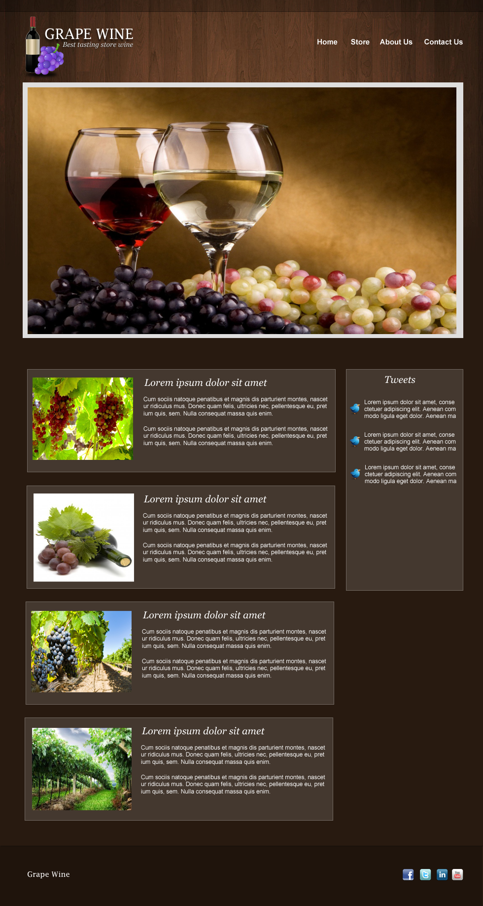
Working with different Client can get your creativity challenged, as I work more with with them I gain a lot of experience and different methods in terms of layout and design. Last week one of my client asked me to design a Wine Design Blog Website that has several features included, I did some research first here and there and sent the mock up to the Client. Overall they were happy, and it’s a good business.
Since I always share the things that I learned from various design projects, the tutorial for today will be a Wine Blog Layout in Photoshop. This one is really simple and easy to make, the main focus here is the look and feel of the site for their products.
You can download the PSD at the bottom of this tutorial!
Below is our Final Product

Before we start, there are couple of things we need to download;
- Wine Vector from Wowvectors
- Fruit Vector from Fordesigner
- Grape Wine Wallpaper from Wallpapercube
- Twitter Bird from Iconarchive
- Wood Texture from here (can’t remember where I downloaded it)
- Social Media Icons from Aquaticus
Let’s Begin!

Open your Photoshop and set the width to 980px & height 1000px, fill in the layer with #281a10.

Drag the wood texture that we download from the top of this tutorial, and click on layer mask.

Select the Gradient Tool (G) and drag it in the direction of the arrows, make sure that the bottom wood is not visible

Grab your Marquee Tool (M) and select the top area, fill it with #000000 and Opacity 23%.

Next is Single Row Marquee Tool (M) and create a line just below the header layer we just created, use brush to fill it with #000000 Opacity 51%.

We now have this on our header.

For the logo we use Lucida Fax Regular 29pt #ffffff.

For the logo text drop shadow, set the foreground color to #000000 and the rest are defaults.

We also added a description, Font was Georgia Italic 14pt.

Description drop shadow, foreground is #000000 distance and size is 1px.

Now we added those vectors, just do a Wand Tool (W) to delete the white background and resize them to right size for the logo.

Next is select Elliptical Marquee Tool (M) and draw a circle like shape at the bottom, and fill it with #000000. Go to Filter > Blur > Gaussian Blur and set it to 2.8%

Here is the complete set of our logo

We also added a navigation text on the right, pretty straight forward so I didn’t have to explain it. Font used was Arial Bold 15pt.

Next is create a new layer (CTRL + N) and select your Marquee Tool (M), fill it with #dfdede

Create a new layer and select the inside of the first layer, fill it with #ffffff. Give a 5px margin for the inner layer

Drag the wine wallpaper on top of the inner slide layer and right click > select create clipping mask.

Now for the content post on the mid bottom part, grab Marquee Tool (M) and set the Fill to 13% (Under Opacity)

For stroke, foreground color is #FFFFFF and size is 1px

Next is I just grab some grape images and set the size for it, text used was; for the title Georgia 20pt Italic and for the content Arial Regular 12pt.

After were done with the first one, we can duplicate it and do the rest of for the page. It’s recommended that you group your layers, for this one we create a group (CTRL+G) called content-post.

For the sidebar, we will do the same for content background. Create a new layer (CTRL + SHIFT+N) and Marquee Tool (M), fill it with #ffffff. Now copy the layer style of the content layer by right click > Copy Layer Style and right click > Paste Layer Style on the sidebar layer.
![]()
We added a couple of text and icon, for the title we use Georgia Italic 20pt and for the tweets Arial Regular 12pt. We also placed our twitter bird icon from iconarchive.

Next is to duplicate the tweets and line them up. Make sure you group them in a folder so your layer palette are clean.

For the footer, create a new layer (CTRL+SHIFT+N) and grab Marquee Tool (M) fill it with #1F140C.

Just like in the header section, we will also add a line on top of our footer. Select Single Row Marquee Tool (M) and use a brush to fill it, foreground color is #000000

For the logo text, we used the same font Lucida Fax 20pt #FFFFFF

For the social media icons we selected a few of the popular ones and line them up.

And we are done!
I hope you’ll learn something here as I did working on a different niche, it’s amazing how things differ in terms of design according to different niche, business.
If there’s something I left out, or you want to make this better just hit me up on the comments below.
[sociallocker id=”3494″]
Download Now![/sociallocker]


