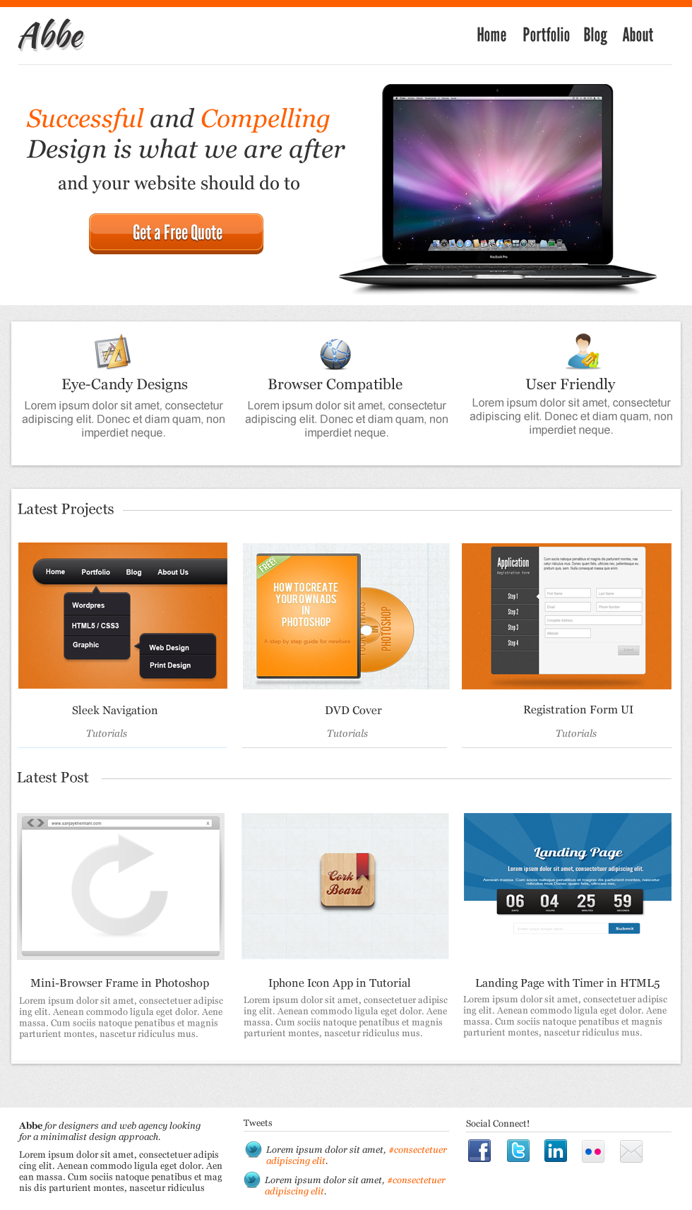
Minimalist is getting more and more popular since last year, most of the themes that I see these days are going for this kind of design. The way minimalist differs from the rest is it’s simplicity and content focused design, which most of the readers like to see in a website (depending on the niche though).
Today we will create a portfolio web layout in Photoshop, we will use different fonts, icons and some images from our previous tutorials. Before we get started we need to download a couple of things.
You can download the PSD at the bottom of this tutorial!
- League Gothic from fontsquirrel
- Kaushan Script from fontsquirrel
- Icons from here
- Mac Book Pro from here
- Social Media Icons from iconarchive
- Twitter Bird from iconarchive
- Tutorial Images are from different tutorials that we made.

After downloading all of the things we need, make sure you already installed our fonts and safely saved our icons and image.
Let’s get started!

Open a new canvas and set it to 980px by 1713px

Create a new layer named border-top, grab Marquee Tool (M) and fill it with #ff6000. Next is to use Kaushan Script font and wrote the name of the site. Use the color #333333, 47.08pt.

For the title’s drop shadow, change the foreground color to #c5c0c0 and angle to 116. Distance is 4px and size is 0.

Next is the navigation, for this one we will use #333333 as foreground color and League Gothic for font, 27pt.

For the slideshow, we already removed the background of Mac Book Pro and leave the shadow below. For the text we use Georgia Italic 36pt #333333, for the smaller font 26pt, the rest is the same.
Also notice the line below the navigation and logo, for that one we grab Single Row Marquee Tool (M) and fill it with #00000 Opacity 12%.

Next is a call to action button, select your Rounded Rectangle and set the radius to 5px.

For inner glow, foreground is set to #fc8c48 choke 100% size 2px.

Copy the color settings for gradient overlay.

For stroke, set the foreground to c94f05 and size to 1px.

Here’s our button, now to add a 3D effect duplicate the button layer and hold CTRL + press down arrow key 3 times, disable the effects and fill it with #a94407.

Create a new layer named this light, fill it with #ffffff. Press CTRL + SHIFT + I after that press DEL, to move the layer press your arrow key up until half way of the button.

Set the opacity to 23%, and press CTRL + SHIFT + I and DEL to remove the excess layer outside the button area.

Now add the text, I use League Gothic color #ffffff 26pt.

For the button text drop shadow, use foreground color #000000 and distance, size to 1px.

For the content background, grab Marquee Tool (M) and select the bottom part of the slide and leave some room for the footer. Make sure you have the same layout as the above image, then create a new layer and fill it with #ececec, add noise 1% uniform and hit ok.

Create a new layer for the background, we use #ffffff and some drop shadow (image below). Use the icons for the images, we also add some text on it. For the title we use Georgia 21pt color #333333, for the content Arial 16pt color #777777.

For the content drop shadow, foreground color is #a2a1a1 and size 5px distance 1px.

For the portfolio section, you can use any image you like, just set the images to 200px by 200px. Font is Georgia 16pt #333333, the category is Georgia 14pt #7777777.

Select Single Row Marquee Tool (M) and draw the line and fill it with #eaeaea. Now grab Marquee Tool (M) and delete the spaces as the images have. The left side of the line will be filled with different color for hover effect, to do that hold CTRL + CLICK on the line layer now select brush and fill the left side line with #D6EDFB. This is done on the same layer of the line.

Next is the latest post section, almost the same with the portfolio section for the text sizes. You can use different images if you like, for this one we use our old tutorial images.

For the footer, we use a three column layout (same with the portfolio and latest post) and mixed with icons and text. Each widget-titles have the same font size, we just added a line underneath. To do that, grab your Marquee Tool (M) and fill it using a brush and foreground color #DADADA.
First is the left side, we use Georgia 14pt #777777 and for the bold #333333. For the tweets link, we use #FF6A10. Social icons are added on the right side, we just aligned them properly.

We are done! I hope I covered most of the layout and design. This is the first part of the tutorial, next is converting this to HTML5 / CSS3 so you better watch the 2nd part 🙂
I hope you learned something new and you can use this on your day to day activities, if you feel that I missed something or you have a question just hit the comments below.
[sociallocker id=”3494″]
Download Now![/sociallocker]


